Research first. Build second.
Designing the HarvardSites Drupal publications experience
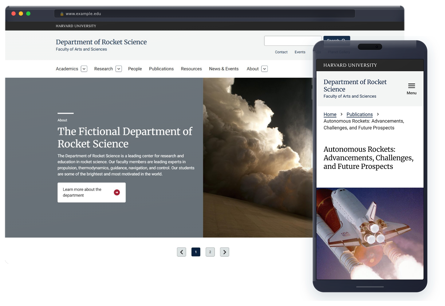
Role: Lead UX Researcher & Designer
Scope: Design systems, Drupal, product work, UX research
THE PROBLEM
Harvard Web Publishing (HWP) was in the middle of a major platform migration, moving from OpenScholar, a legacy CMS, to HarvardSites Drupal, a platform that serves thousands of sites across Harvard's schools, departments, and research centers. Publications was one of the core content types we needed to build from scratch for the new platform. This wasn't a minor feature. Faculty, researchers, students, and site builders across the entire university rely on publications pages to showcase academic work. Getting it wrong would mean migrating thousands of sites onto a platform that didn't actually serve their needs.
The problem was we didn't have a clear picture of what "right" looked like yet. Our development partner Jakala assisted in the creation of wireframes, but we needed user feedback before the wireframes became a finished product. I led the user research and design research effort to get that feedback before it was too late to act on it.
THE CONSTRAINTS
The platform was going live soon and sites were already queued to migrate. That meant every decision we made had to account for what was actually buildable within the timeline, not just what was ideal. We were also operating within HWP's governance model around accessibility and design standards we built, which shaped what we could and couldn't commit to for v1. Additionally, I brought in a background that no one on the team had. I worked as a higher education librarian earlier in my career, which gave me a specific lens on citation formats, bibliographic standards, and what academic users actually expect from a publications interface.
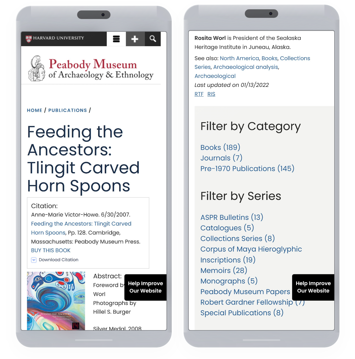
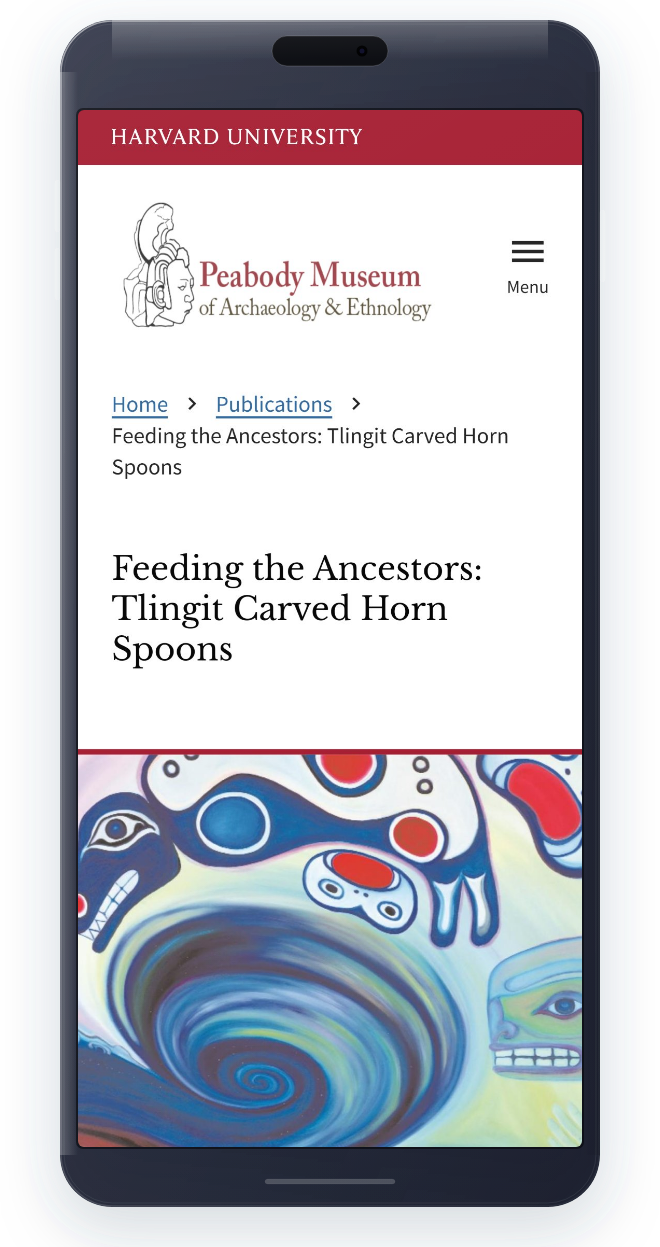
Mobile design of a publication page from an OpenScholar website.
DECISION POINTS
Decision #1: Citation list design only for v1
What I noticed
During user interviews, participants had strong opinions about layout. Some wanted card grid views with thumbnails. Others wanted dense citation lists. What was clear acoss the board was the desire for flexibility.
The choice we made
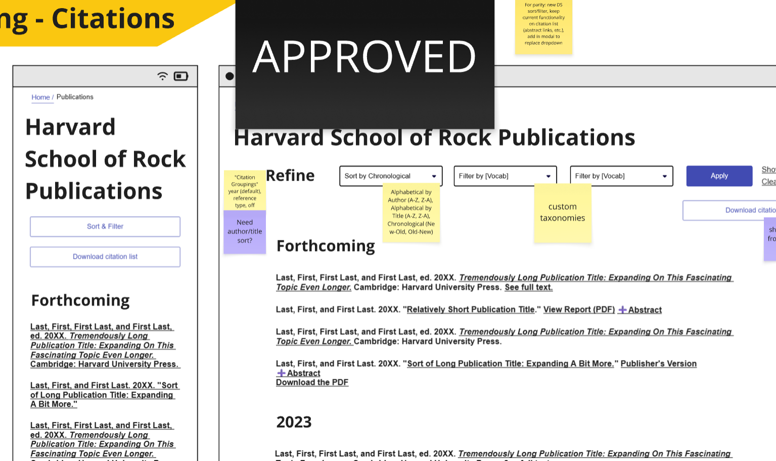
For the initial release, we limited site builders to citation list format only. Card and grid views with thumbnails were deferred to a later release.
Why that choice was made
Given our timeline and maintenance considerations, we couldn't responsibly commit to building and supporting multiple display formats for launch. The citation list format was the most functional baseline and covered the broadest use case, based on user research feedback I collected. We logged the card/grid view as a priority for a future sprint, and it did eventually ship.
Decision #2: Multiple citation format options for site builders and site visitors
What I noticed
Early conversations in the team leaned toward keeping citation format options minimal to reduce complexity. But coming from a library background, I knew that citation flexibility was necessary. Researchers have specific requirements depending on their discipline.
The choice I made
I pushed back and advocated for giving site builders and site visitors the ability to choose from multiple citation formats (BibTex, EndNote XML, EndNote Tagged, Marc, PubMed XML, PubMedid, and RIS) when importing, exporting, and downloading citations.
Why that choice was made
Early conversations in the team leaned toward keeping citation format options minimal to reduce complexity. But coming from a library background, I knew that citation flexibility was necessary. Researchers have specific requirements depending on their discipline.
Decision #3: Bulk import deferred
What I noticed
Site builders managing large publication collections flagged bulk importing as a major pain point. Manually entering hundreds of publications was an obvious burden. Participants wanted support for importing from platforms like Google Scholar, PubMed Central, JSTOR, and Harvard's own DASH repository.
The choice I made
Bulk import functionality was logged in Jira and deferred from v1.
Why that choice was made
This was a real tradeoff. We knew it was needed. But the complexity of building reliable integrations with third-party repositories and bulk functionality within our timeline wasn't feasible. Calling it out clearly and documenting it meant it didn't get lost.
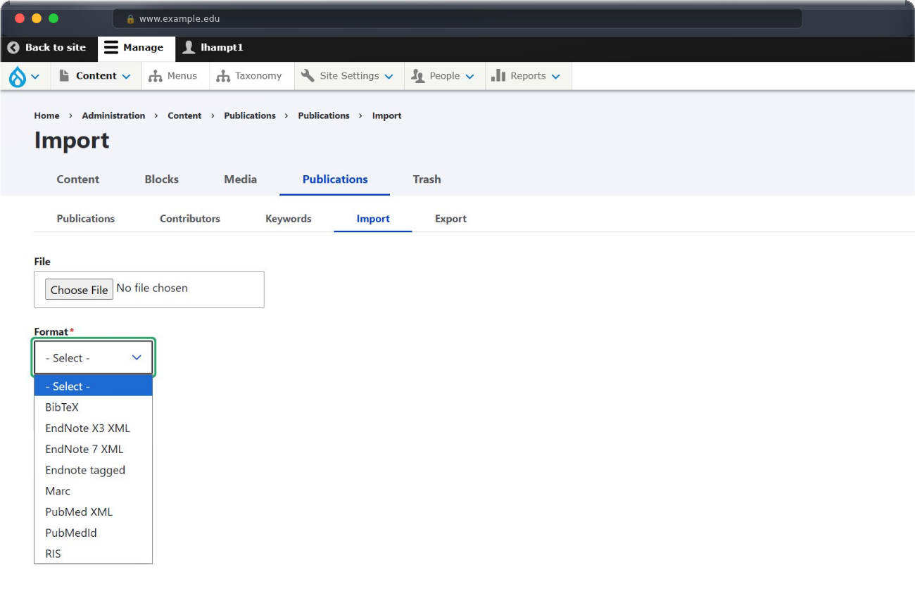
Citation import interface for site builders.
OUTCOMES
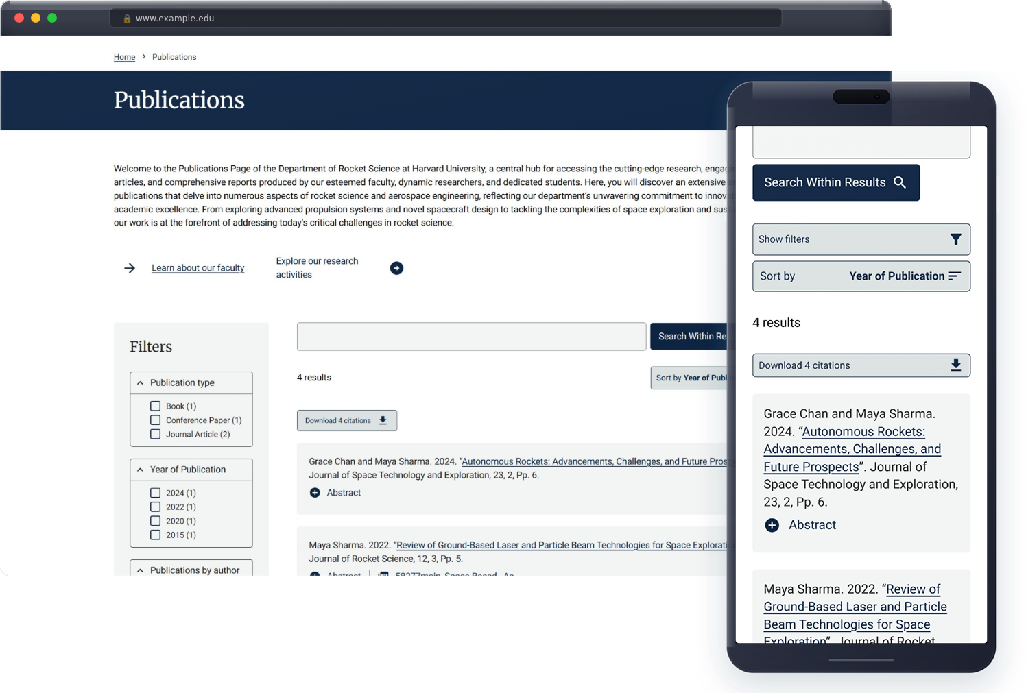
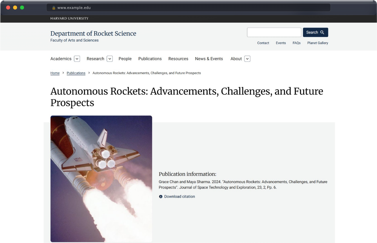
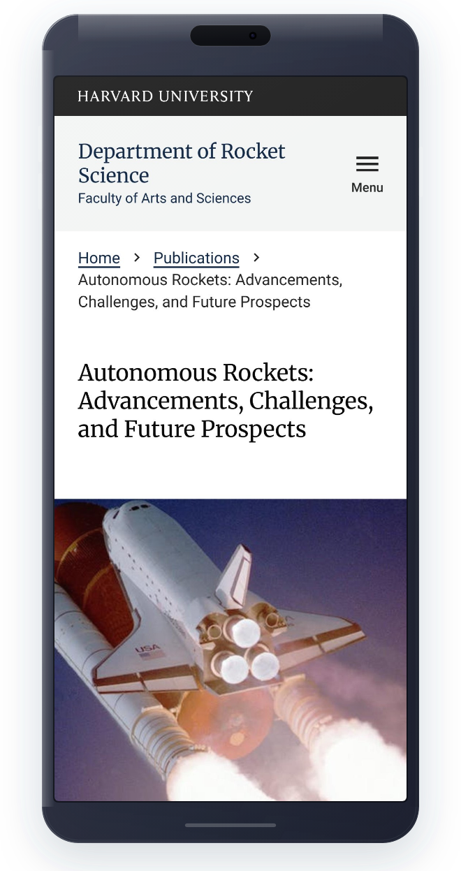
The research findings and prototypes were presented to the HWP team and Jakala. Several recommendations made it directly into the final design:
Horizontal citation list view as the default listing format
Abstract expand/collapse feature in publication lists
Breadcrumb navigation on publication listing and detail pages
Download citation functionality with multiple format options
Optional download access directly from listing pages
Clearer sort and filter display showing the number of results
Card with thumbnail design was delivered in a later release as planned
REFLECTION
This project reinforced something I've carried through a lot of my work. Subject matter expertise is a design asset. My library background wasn't incidental here. It directly shaped the research questions I asked, the tradeoffs I pushed back on, and the recommendations I advocated for with the team. It's rare to work on something where your background lines up this cleanly with the problem. That made this project one of my favorites.