More than a gallery
Designing an accessible media gallery from zero
Role: Lead UX Researcher & Designer
Scope: UX research, design discovery, wireframing, prototyping, accessibility testing
THE PROBLEM
HarvardSites Drupal is Harvard University's centrally supported web publishing platform. It's a modern Drupal CMS built to serve the broad range of schools, departments, research centers, administrative offices, and scholars across the university. As more teams came onboard and started building out their sites, a recurring request surfaced. They needed a way to display collections of media. The closest thing the platform had was the now Image Collage Component, but it wasn't meeting the mark. That meant building something purpose-built for the job to meet our stakeholders’ needs.
This wasn't unfamiliar territory for me. Before moving into UX, I worked as an academic librarian specializing in digital collections and repositories, helping institutions build online exhibits and archives of cultural heritage materials. My background meant that I already understood the range of contexts this component would need to serve. What it should look like, what it should do, and how it would be built were all still open questions. There was no existing design to iterate on, no established requirements, and no prior research to draw from. This was a discovery-first project, and the work started at zero.
THE CONSTRAINTS
Discovery work for this project started in April, 2025. Early in the process, the team aligned on a key structural decision. The media gallery would be a component that site builders add to pages, not a standalone content type with its own URL. That meant it lived within the design system’s existing component framework, inheriting its configuration patterns, color scheme system, and section heading structure. It also needed to support functionality no other component had tackled before, like lightbox modals and large item counts.
Harvard Web Publishing builds to WCAG AA standards, and HarvardSites is used by a wide and diverse population. Some patterns that looked appealing in competitive research, like masonry layouts, swipe-only navigation, and download buttons, were ruled out or deferred specifically because of access concerns.
The platform had launched, but that didn't mean things were settled. The component library was still growing, priorities shifted as new stakeholder needs surfaced, and what was technically feasible wasn't always known until someone actually tried to build it. The must-haves and hard nos for this new feature evolved over time.
DECISION POINTS
Decision #1: Lead with competitive research
What I noticed
Before I could have a useful conversation with the team about what we should build, we needed a shared picture of what already existed. Media galleries appear across a huge range of contexts, like museum collections, art portfolios, photo archives, academic exhibition sites. Some use lightboxes, some use media detail pages, some use carousels, and some use grids. The features that make sense for a fine art archive aren’t necessarily the right choices for a university dining site.
Rather than presenting a single recommendation, I collected and annotated examples from more than a dozen real-world implementations. Some of these examples included the Met, the Walters Art Museum, the British Library, Stanford University’s design system, and various e-commerce sites. For each, I flagged specific features and design decisions with sticky notes, naming what I saw, and why it might or might not be relevant to our context.
The choice I made
I brought all of that research into a two-part team workshop on a shared Miro board and walked the team through it before asking them to make any decisions. Every screenshot had annotations. Every annotation connected to a functionality question. The goal was to give everyone the same visual vocabulary and reference set before we started prioritizing.
Why that choice was made
When teams make product decisions without a shared understanding of the space, you get misaligned assumptions about what a feature even means. “Lightbox” means one thing to a developer who’s implemented PhotoSwipe and something else to a content editor who’s never thought about modal behavior. Grounding the conversation in real examples meant we were all working from the same reference points. It also surfaced use cases and patterns the team hadn’t considered, which changed how some features were categorized in the prioritization work that followed.
Decision #2: Use the workshops to prioritize features and scope media support to images only
What we noticed
Media galleries are feature-rich by nature. They can have carousels, lightboxes, filtering, fullscreen mode, masonry layouts, and embed capabilities. There was a foundational question our team had. What media types should the gallery support? As the workshops progressed, the answer evolved. Supporting video and audio introduced significant accessibility implications, like captions, keyboard controls, focus management, that don't exist for static images. And handling multiple media types consistently across a grid, a lightbox, and mobile was a substantially larger engineering lift than images alone.
The choice we made
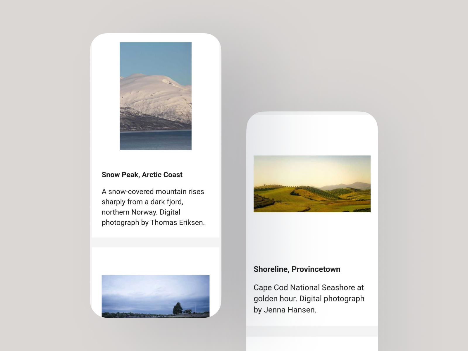
I ran a MoSCoW-style prioritization exercise across the workshop sessions, working through every feature as a team. In parallel, I designed and iterated on wireframes to translate those conversations and discovery phase findings into something concrete. Early drafts kept options open while decisions were still being made, and each revision narrowed as priorities solidified. By the end of the workshops, the team made a fundamental decision. The MVP would support images only, with grid and list display modes, a lightbox modal on click, titles and captions, keyboard navigation, and screen reader support.
Why that choice was made
Scoping to images was the right call given what we knew. Shipping a component that handles images well, accessibly, and consistently across devices is more useful than shipping something that technically supports video but does it badly. The decision also gave engineering a tighter, more achievable target for v1, and it gave the team a clear story to tell stakeholders what was on the horizon.
Decision #3: Treat UAT as a design feedback loop, not a complete sign-off
What I noticed
When the first build of the media gallery component was ready for review, I ran an internal UAT (user acceptance testing) session with the full product team, including digital accessibility specialists, developers, designers, and project managers. The session surfaced a significant number of issues, including broken image cropping, lightbox scrolling bugs on mobile, focus management problems in the modal, media titles rendering as headings, and more. Some were expected rough edges but some pointed to misalignments between the content model as designed and how it had been implemented.
The choice I made
Rather than producing a simple pass/fail report, I organized the UAT findings into a structured spreadsheet. I lead a team workshop to review the findings together in a triage session, making collective calls on severity and priority. Blockers were entered into Jira immediately for design and development to address before release. Enhancements that required significant effort were documented and reserved for a future iteration, keeping the path to launch clear without losing track of what still needed attention down the road.
Why that choice was made
Working in an agile environment means UAT is a built-in part of the cycle. Issues get surfaced, triaged, and fed back into the next sprint. That's exactly how this session functioned. Every issue documented in the spreadsheet had a clear owner, a severity level, and a path to resolution before release.
OUTCOMES
The media gallery component went from a loose set of stakeholder requests to a released new feature with standards and requirements.
Discovery workshops completed covering 15+ implementations and a full feature prioritization with the product team
Media support scoped to images only for v1, with video and audio deferred based on accessibility requirements and engineering complexity
Two rounds of wireframes iterated, landing on a focused MVP of grid display design only with a lightbox modal
High-fidelity prototype produced for desktop, mobile, and lightbox views
30+ issues and enhancements triaged and tracked to Jira from two rounds of UAT
Assistive technology testing completed via Fable
Component released in December 2025
REFLECTION
My background as an academic librarian, specifically the years I spent working with digital collections, repositories, and online cultural heritage exhibits, gave me a frame of reference for this project that went beyond standard UX practice. I knew what it meant to curate a collection for public access and the questions that mattered. How do I organize this content? What context does the viewer need? What happens when the collection grows?
That experience informed the questions I posed to my team, what I looked for in the competitive analysis, and why certain decisions felt more consequential than others. It's a reminder that the work you did before UX doesn't disappear. Sometimes it's exactly what a project needs.