What I Learned Doing a Heuristic Evaluation on an AI Assistant Dashboard

May 12, 2026
I recently wrapped up a heuristic evaluation of an AI assistant dashboard, and it was one of the more interesting UX problems I've worked on in a while. Evaluating an AI tool pushes you to think about usability in ways that a traditional web app just doesn't require. I wanted to write up what I did and what I found.
The project
The opportunity to be the UX person on a product team for an AI platform has been on my bucket list for a couple of years now. I am happy to share that I was recently able to check it off my list. My team at Harvard Web Publishing (HWP) has been partnering with HUIT's Strategic AI Initiative to help bring an AI assistant chatbot to life for Harvard's IT community. We have a pretty direct stake in it since we're planning to use the bot as a help tool for HarvardSites Drupal, the web publishing platform our team built and maintains. The idea is that site builders who need help managing their sites could turn to the bot instead of digging through documentation. We'd feed it our docs and configure it to be a useful, knowledgeable assistant.
So when the opportunity arose for our team to join the project, we were happy to jump on it. HWP isn't the only team involved. Other departments across Harvard IT will be using that platform and giving feedback too. My role has been leading the UX initiative, and the first thing I tackled was a holistic heuristic evaluation of the dashboard from the bot owner experience. This is the interface that people and teams will use to configure, manage, and monitor the assistant.
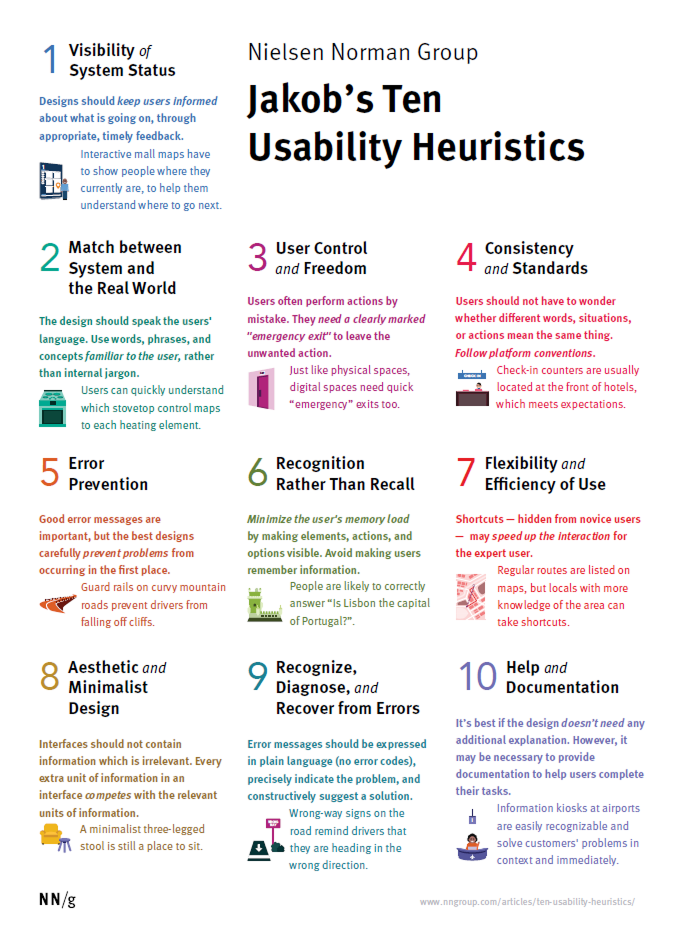
Starting with Nielsen's Ten Heuristics
I used Nielsen Norman's Ten Usability Heuristics as my primary evaluation framework. If you're not familiar, it's one of the most widely recognized approaches to heuristic evaluation in UX. It’s a set of ten general principles for interaction design developed by Jakob Nielsen. It covers things like: does the system keep users informed about what's happening? Does it speak the user's language? Does it prevent errors?
It's a well-established framework and a solid starting point for almost any interface. But as I got into the evaluation, it became clear that the standard ten heuristics don't fully cover what makes an AI configuration interface usable. There are things specific to this type of platform that Nielsen's heuristics either touch on only partially or don't address at all.
Adding platform-specific heuristics
This is the part I found most interesting methodologically. I ended up creating four additional heuristics specific to the AI assistant platform:
P1 - Conceptual Clarity: Does the interface expose AI/platform concepts (vector stores, embeddings, tokens, CORS) in ways that make sense to a non-technical bot owner?
P2 - Trust and Transparency: Does the system clearly communicate what the AI will do, what data it has access to, and what the consequences of configuration changes are?
P3 - Safe Defaults and Blast Radius: Are dangerous or irreversible actions (deleting files, replacing prompts, public access settings) appropriately guarded, defaulted conservatively, and clearly communicated?
P4 - Multi-tenancy Legibility: Is it clear which assistant you're configuring, what scope your changes affect, and how your assistant relates to others on the platform?
Each of these heuristics emerged from thinking carefully about who the actual users of this dashboard are and what could go wrong for them. The bot owner audience for this platform includes a lot of people who are not developers. They're content managers, communications staff, department admins. A heuristic about conceptual clarity matters a lot when the interface surfaces terms like "vector store" and "embeddings" to someone who has never worked with AI infrastructure before.
The blast radius heuristic felt especially important. On a typical web form, a user might accidentally submit something they didn't mean to. On an AI configuration platform, a user might accidentally overwrite months of carefully tuned prompting, or expose a chatbot publicly when they didn't intend to. The stakes of configuration errors are genuinely higher, and the evaluation framework should reflect that.
These four felt essential for a platform where someone with limited technical background might accidentally overwrite a system prompt, expose an internal only chatbot publicly, or delete knowledge base files and not realize what happened until something breaks.
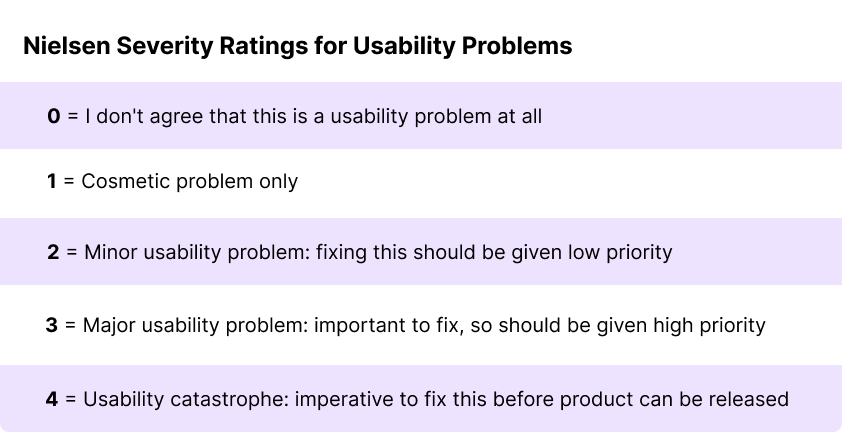
Rating severity
Each finding was rated on Nielsen's 0-4 severity scale, determined by weighing three factors:
How often a user could encounter the problem (frequency)?
How bad are the consequences when they do (impact)?
Can they work around it or can they become stuck (persistence)?
What the evaluation produced
In total I identified 17 actional findings across the 14 heuristics, ranging in severity. I clustered the findings into five themes, which I'll be sharing with the project team as part of the handoff. I'm keeping the specifics internal for now since the evaluation is still in process, but the volume and distribution of findings across severity levels gave a pretty clear picture of where the platform needs the most attention.
A few things I’d think about differently for AI tools
For anyone that ever finds themselves UXing an AI-based product, these are some things I found worth flagging that can be helpful.
The vocabulary problem is real. AI infrastructure involves a lot of concepts that have no intuitive real-world equivalent for most users. An AI platform designed for non-developers has to make deliberate choices about how to surface or abstract these concepts. It's worth having a specific heuristic for this rather than trying to fold it into "match between system and the real world," because the gap between the platform's technical vocabulary and the user's mental model is often much wider than it would be for a typical web app.
Trust and transparency deserve their own lens. When a user interacts with an AI assistant, there's a lot happening that isn't visible. What data the bot has access to, how it's been instructed to behave, what the consequences of a configuration change will be are all questions users may have. Standard usability heuristics touch on feedback and system status, but AI tools raise the stakes around transparency in a way that warrants more explicit attention.
Scope and multi-tenancy matter more than you'd think. Within the context of this specific AI tool, with a platform that hosts multiple AI assistants across multiple teams, users need to always know which assistant they're working on, what their changes will affect, and where the boundaries are. This is easy to underestimate until you're actually walking through the interface and noticing how many opportunities there are for a user to lose their orientation.
A few reflections on evaluating AI tools
Doing a heuristic evaluation on an AI assistant dashboard was different from evaluating a traditional web interface, and a few things stand out.
The stakes of configuration errors are higher. On a typical web form, a user might accidentally submit something they didn't mean to. On an AI configuration platform, a user might accidentally retrain a bot's behavior, expose it to unintended audiences, or overwrite months of carefully
What's next
The evaluation is done and I'll be sharing it with the project team shortly. I'm hoping the themes provide a clear path forward.
I'm genuinely excited about where this project is headed. Helping HarvardSites site builders get answers quickly without hunting through documentation is something I care about, and good UX on the bot owner side is what makes that possible. If you're doing similar work on AI tools and want to compare notes, I'd love to hear from you!